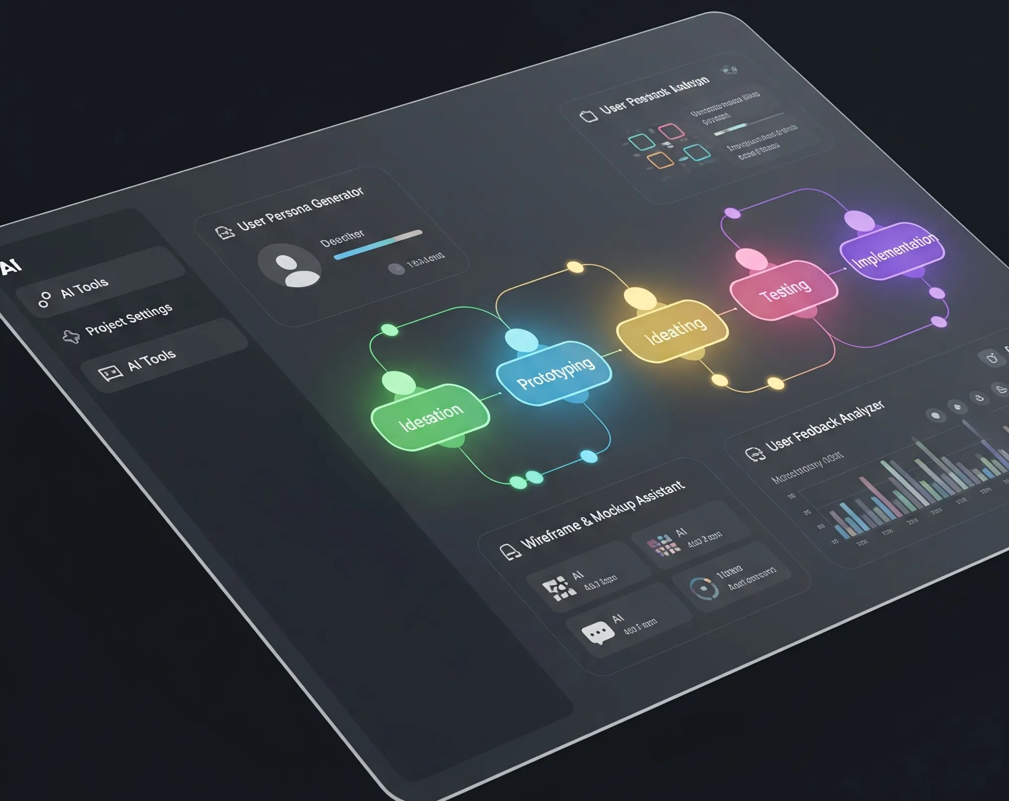
Welcome to OMIA Studio — the all-in-one, web-based platform designed to take your ideas from concept to product in record time. Whether you’re designing a sleek web app, a functional dashboard, or an advanced deep-tech interface, OMIA gives you the tools to build responsive, production-ready applications right from the canvas.
At the heart of OMIA is its intuitive drag-and-drop interface — a fluid workspace where design and functionality meet. But good design isn’t just about looks; it’s about scale. A great UI should remain crisp, clean, and usable across all screen sizes.
To help you build fluid, adaptive designs that scale beautifully, here are 5 key features and tips to master in OMIA Studio.
Anchors: Control Positioning on Any Screen
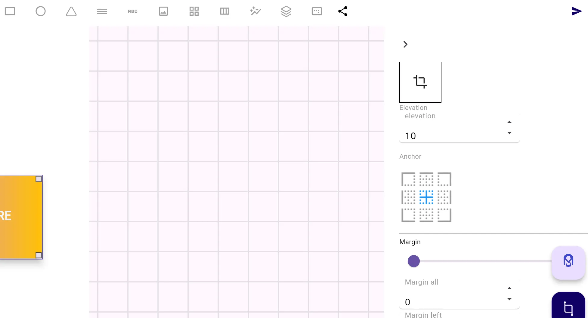
Every widget in OMIA has an anchor point, adjustable via the right-hand editor panel. By default, widgets are anchored to the top-left of their container — but this can be changed to suit your layout’s responsiveness.
As the page resizes, anchor points determine how each widget behaves relative to its parent container. For example, if you place a button at the bottom right of a container and want it to stay there regardless of screen size, simply anchor it to the bottom-right.
Anchors are your first line of defense against misaligned UIs.
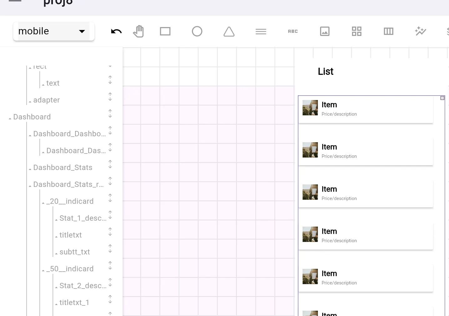
Adapters: Dynamic Lists Made Simple
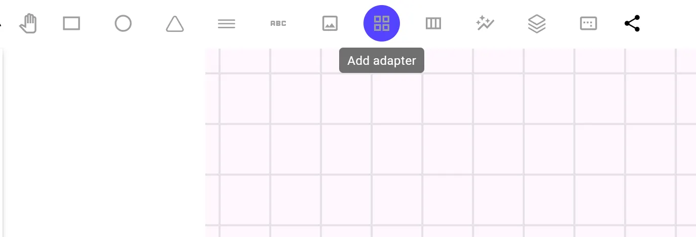
While more functional than visual, adapters are a must-know tool for both designers and developers. They allow you to dynamically populate a list of elements at runtime.
On the canvas, an adapter shows up as a blank container — but under the hood, it’s a powerful structure for managing dynamic content.
To set it up:
- Design the item view that will be repeated
- Add that view as a child inside the adapter
- At runtime, elements will populate this container dynamically
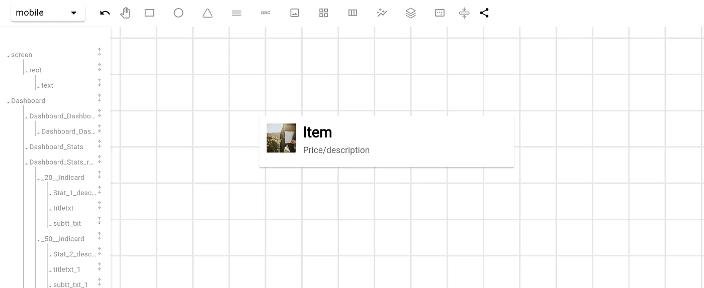
You can also choose the adapter type — vertical or horizontal — depending on whether items should stack as a list or a row.
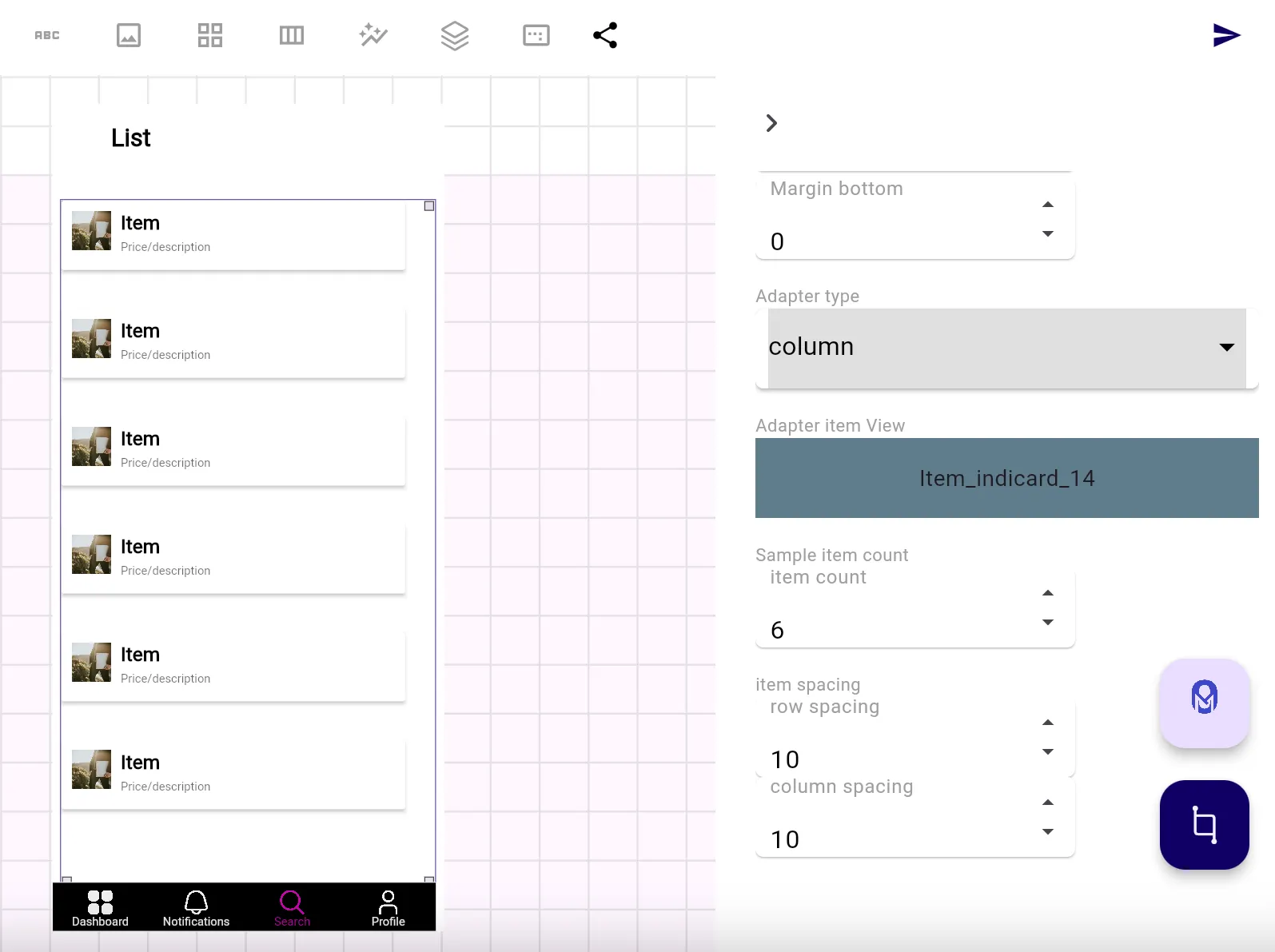
Specify how many child elements appear during development for preview purposes, with the item count property.
Note: These child items won’t appear in production. They’re only placeholders — the real content is injected via code at runtime.
States: Design for Mobile and Desktop
OMIA Studio supports responsive design out of the box with canvas states for mobile and desktop.
All widgets remain visible across states, and you can switch views at any time. While OMIA uses a mobile-first approach by default, you’re free to switch to desktop state and:
- Rearrange elements
- Update anchors
- Customize styles for wider screens
This ensures that your UI remains consistent, accessible, and beautiful across devices — from smartphones to large desktop monitors.
Images & Filters: Visual Clarity at Every Size
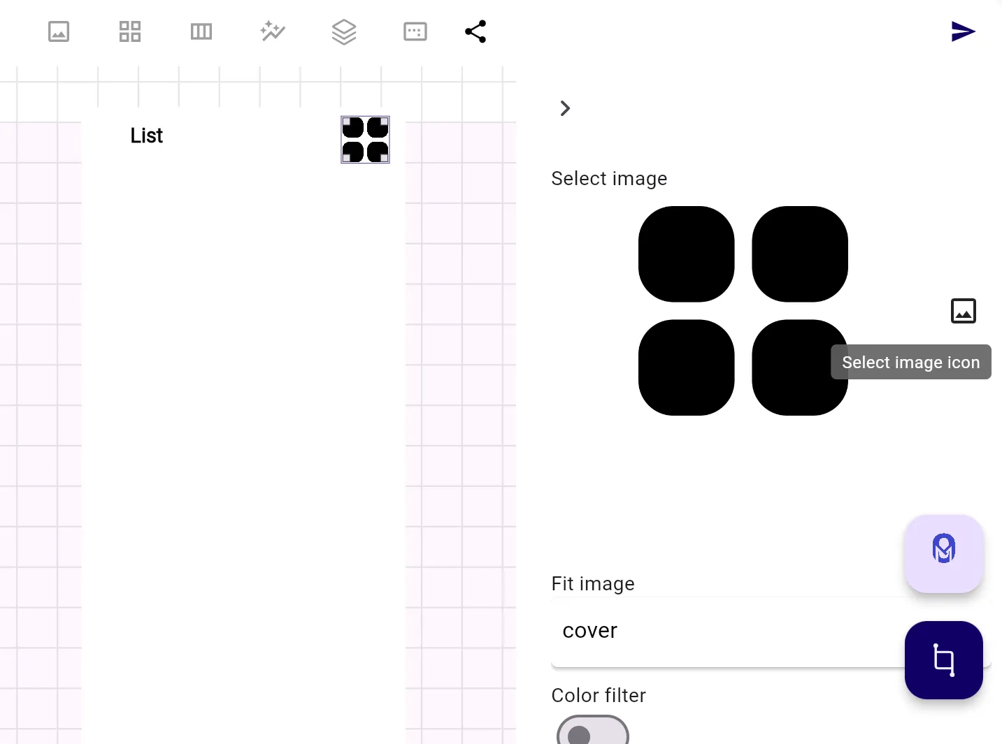
Adding visuals in OMIA is as easy as dragging in an Image Element. Whether you’re working with icons, backgrounds, or illustrations, OMIA offers tools to manage your visuals with precision.
You can swap out images at any time using the built-in selector. Want to give your UI a more unified aesthetic? Apply color filters to images directly on the canvas.
Clean, adaptable visuals help your design feel polished — and in OMIA, you control every detail.
Fits & Dimensions: Build for Scale
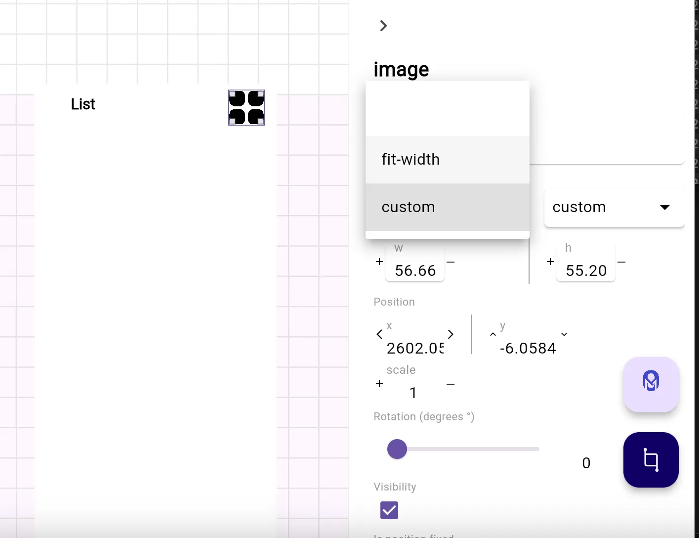
Responsive UIs thrive on proper fit settings. OMIA allows you to set widget width/height relative to their parent container — for example, setting a background to stretch the full width of the screen.
Tips to keep in mind:
- Use Fit Parent wisely — it works great on smaller screens but may break layouts on larger ones
- Test your layouts across screen sizes by switching states frequently
- Combine fit settings with anchors for maximum responsiveness
Building for scale doesn’t mean sacrificing control — OMIA gives you both.
Merry Builds!